You’ve got traffic. Visitors are landing on your website. But they’re not buying, they’re not calling, they’re not booking. They’re just… leaving.
Sound familiar? Here’s the uncomfortable truth: most small business websites are designed to look good, not to convert. They’re digital brochures when they should be sales machines.
The difference between a website that generates leads and one that collects digital dust isn’t mysterious—it comes down to seven specific features that psychology and data prove actually work. Miss even one of these, and you’re leaving money on the table every single day.
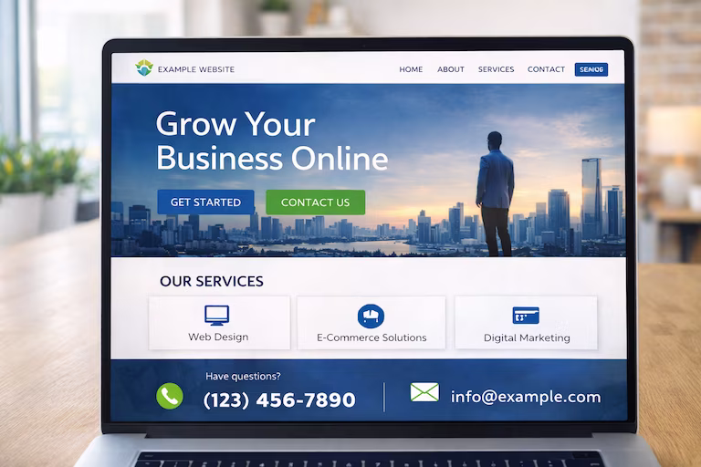
1. Crystal-Clear Value Proposition (Above the Fold)
You have 3 seconds. That’s it. Three seconds for a visitor to understand what you do, who you help, and why they should care.
Most small business websites fail this test spectacularly. They lead with generic corporate speak: “Welcome to our website” or “Providing quality services since 2015” or the dreaded “Your trusted partner in excellence.”
These phrases communicate absolutely nothing of value.
What a Real Value Proposition Looks Like
Bad: “ABC Plumbing – Quality Service You Can Trust”
Good: “Emergency Plumber in Stockton – 30 Minute Response, Fixed Price Guarantee”
See the difference? The second one tells you:
- What they do (emergency plumbing)
- Where they operate (Stockton)
- Their competitive advantage (30-minute response)
- Why you won’t get ripped off (fixed pricing)
All in one sentence. No fluff. No corporate nonsense. Just clarity.
The Formula That Works
Your value proposition should answer three questions immediately:
- What do you actually do? Not your industry—your specific solution
- Who do you do it for? Be specific about your ideal customer
- Why should they choose you? Your unique advantage in one compelling benefit
Place this prominently at the top of your homepage. Don’t bury it. Don’t hide it behind a slider. Don’t make people scroll or click to understand what you offer. For more on overall web design principles, check out our complete guide to web design for small business.
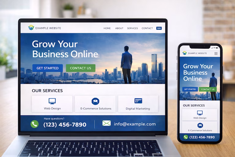
2. Mobile-Responsive Design (That Actually Works)
Let’s be blunt: if your website doesn’t work perfectly on mobile, you’re actively turning away more than half of your potential customers.
In 2026, over 65% of web traffic comes from mobile devices. For local businesses, that number is even higher—people searching “plumber near me” or “web designer Middlesbrough” are doing it from their phones while they have an immediate need.
But “mobile-friendly” isn’t enough. Your website needs to be mobile-first.
What Mobile-First Actually Means
Touch-friendly buttons: Every clickable element needs to be at least 44×44 pixels. Tiny links that require surgical precision to tap? You’ve lost the customer.
Readable text without zooming: Minimum 16px font size. If people need to pinch-zoom to read your content, they won’t. They’ll leave.
Fast loading on mobile networks: Your site should load in under 3 seconds on 4G. Anything slower and your bounce rate skyrockets.
Simplified navigation: Hamburger menus are fine, but your most important links (services, contact) should be immediately visible.
Forms that don’t cause rage: Keep mobile forms to absolute essentials. Name, email, phone, message. That’s it. Every additional field is a reason for someone to give up.
The Mobile Test
Pull out your phone right now. Load your website. Try to complete your primary conversion action (call you, fill out a form, whatever it is). Can you do it in under 30 seconds without frustration?
If not, you’re losing customers every single day.
3. Strategic Call-to-Action Buttons (Not “Learn More”)
Every page on your website should have a purpose. What do you want visitors to do? If you can’t answer that in one sentence, your page has failed.
Most small business websites suffer from vague, weak CTAs that inspire exactly zero action:
- “Learn More” (about what?)
- “Click Here” (why?)
- “Submit” (sounds like homework)
- “Contact Us” (too generic)
CTAs That Actually Convert
Effective call-to-action buttons follow a simple formula: Action + Benefit + Urgency
Weak: “Learn More”
Strong: “Get Your Free Quote in 60 Seconds”
Weak: “Contact Us”
Strong: “Book Your Free Consultation Today”
Weak: “Submit”
Strong: “Send My Free Guide”
Notice how the strong versions tell you exactly what happens when you click and what you’ll get out of it?
CTA Placement Strategy
Don’t just stick one CTA at the bottom of your page and call it done. Strategic websites include:
- Above-the-fold CTA: Primary action right at the top
- Mid-content CTAs: After you’ve built trust and shared value
- Bottom-of-page CTA: For people who read everything
- Sticky header/footer: Contact information always visible
- Exit-intent popup: Last chance to capture abandoning visitors (use sparingly)
Multiple CTAs don’t confuse people—they give options for different levels of commitment. Someone might not be ready to “Book Now” but they’ll happily download a free guide.
4. Trust Signals (Proof That You’re Legit)
Nobody wants to be the first customer. Everyone wants to work with the established, trusted business that other people have already vetted.
That’s where trust signals come in—the evidence that you’re legitimate, professional, and worth working with.
Essential Trust Signals for Small Business Websites
Testimonials with real names and faces: “Great service! – John” is worthless. “Danny at Captivating transformed our website in a week and we’ve seen a 40% increase in enquiries – Sarah Mitchell, Owner, Mitchell’s Café, Yarm” is gold.
Client logos: If you’ve worked with recognisable businesses, show them. Social proof through association.
Reviews and ratings: Embed your Google reviews. Link to your Trustpilot profile. Display your 4.9-star rating prominently.
Case studies: Detailed examples of how you’ve solved problems for real clients. Include specifics: “We increased their website traffic by 150% in 3 months.”
Professional credentials: Certifications, memberships, awards. Don’t be modest—if you’ve earned recognition, display it.
Contact information that proves you’re real: Physical address, phone number, business registration number. The more transparent you are, the more people trust you.
Security badges: SSL certificate, secure payment icons, GDPR compliance. These reassure people it’s safe to do business with you.
What NOT to Do
Don’t use fake testimonials. People can smell them a mile away, and they destroy trust rather than build it.
Don’t use stock photos pretending they’re your team. Your actual team photo taken on a phone is better than a stock image of diverse people in suits smiling at a laptop.
Don’t make claims you can’t back up. “Best in the UK” without any supporting evidence just makes you look desperate.
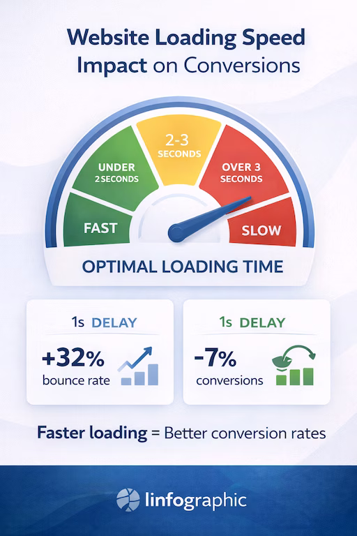
5. Fast Loading Speed (Because Patience Is Dead)
Your website speed isn’t a nice-to-have technical detail. It’s a conversion killer.
The data is brutal:
- A 1-second delay in page load time reduces conversions by 7%
- 40% of users abandon a website that takes more than 3 seconds to load
- Google actively penalises slow websites in search rankings
If your small business makes £50,000 annually from your website and your site is slow, you could be losing £3,500+ every year just from load time issues. To understand how web design and technical performance work together, see our article on why web design and SEO must work together.
The Speed Targets
In 2026, your website should load in:
- Under 1.5 seconds: Excellent (you’re beating most competitors)
- 1.5-3 seconds: Good (acceptable but room for improvement)
- 3-5 seconds: Poor (you’re losing customers)
- Over 5 seconds: Terrible (you might as well not have a website)
Quick Wins for Speed
Image compression: Your 5MB product photo doesn’t need to be that large. Use tools like TinyPNG or ShortPixel to compress without quality loss.
Lazy loading: Images below the fold don’t need to load immediately. Let them load as users scroll.
Minimize plugins: Every WordPress plugin you add slows things down. Do you really need 47 plugins?
Use a CDN: Content delivery networks serve your images from servers closest to your visitors. Cloudflare has a free tier.
Upgrade your hosting: That £3/month hosting is costing you far more in lost business. Invest in decent hosting.
Test regularly: Use Google PageSpeed Insights monthly. Speed degrades over time—monitor it. For more on why WordPress is ideal for performance optimization, read our guide on why WordPress wins for SEO.
6. Simple, Intuitive Navigation (The Grandmother Test)
If your 75-year-old grandmother can’t figure out how to find your contact page in 5 seconds, your navigation is too complicated.
Complex navigation doesn’t make you look sophisticated—it makes you look confusing. And confused visitors don’t convert. They leave.
Navigation That Works
Maximum 7 menu items: Human working memory can handle about 7 items. Beyond that, people feel overwhelmed.
Clear, obvious labels: Not “Solutions Portfolio” (what does that even mean?). Use “Services” or “What We Do.”
Logical hierarchy: Group related items under dropdown menus, but don’t nest more than one level deep.
Sticky header: Keep navigation visible as people scroll. They shouldn’t have to scroll back to the top to navigate.
Search function: If you have more than 20 pages, include a search bar. Make finding information easy.
Footer navigation: Repeat key links in your footer for people who scroll to the bottom.
The Essential Pages
Your main navigation should include:
- Home (your logo should also link here)
- Services (or Products, or What We Do)
- About (who you are and why people should trust you)
- Portfolio/Case Studies (proof you can deliver)
- Blog/Resources (if you have one)
- Contact (make this obvious—don’t hide it)
That’s 6 items. Simple. Clear. Effective.
7. Contact Information Everywhere (Make It Stupidly Easy)
You’d be shocked how many small business websites make it difficult to actually contact the business.
Hidden phone numbers. Contact forms with 15 required fields. No email address. “Office hours” without specifying timezone. Contact pages with nothing but a form and no alternative contact method.
Every barrier you put between a potential customer and contacting you is money lost.
The Contact Formula
Phone number in the header: Visible on every page. Clickable on mobile (makes it one-tap to call).
Email address visible: Not hidden behind a form. Some people prefer email—give them the option.
Simple contact form: Name, email, phone (optional), message. That’s it. Every additional required field reduces conversions by 5-10%.
Physical address: If you have a physical location, show it. Include a map. This builds trust and helps with local SEO.
Business hours: When can people actually reach you? Be specific. “Monday-Friday 9-5” is vague. “Monday-Friday 9am-5pm GMT” is clear.
Social media links: Some people prefer reaching out via Facebook or Instagram. Make it easy.
Live chat (if appropriate): For higher-ticket services or e-commerce, live chat can dramatically increase conversions. But only if someone actually responds quickly.
The Contact Page Itself
Your contact page should be comprehensive:
- All contact methods clearly displayed
- Embedded map showing your location
- FAQ section answering common pre-contact questions
- What to expect after contacting you (response time, next steps)
- Alternative ways to get in touch (booking calendar, WhatsApp, etc.)
Don’t make people hunt for how to contact you. Make it the easiest thing they do all day.
Bringing It All Together
These seven features aren’t optional extras. They’re the foundation of a website that actually converts visitors into customers.
Most small business websites have maybe 2-3 of these features. The ones that dominate their markets? They have all seven, implemented properly.
Here’s your action plan:
- Audit your current website against these seven features – be brutally honest
- Prioritize the biggest gaps – where are you losing the most potential customers?
- Fix one feature per week – sustainable improvement beats overwhelming yourself
- Test and measure – use Google Analytics to track improvement in conversions
The businesses that treat their website as a conversion tool rather than a digital brochure are the ones that grow. The ones that implement these features properly are the ones that dominate their local markets.
Your competitors are reading this too. The question is: who’s going to implement it first?
At Captivating.co, we build every small business website with these seven conversion features baked in from day one. No fluff, no unnecessary complexity—just websites that turn visitors into customers. If you’re ready for a website that actually works for your business, let’s talk.
